Entity Labels
Problem
We need a consistent way to visually represent the five principle RadGrad entities: Career Goals, Interests, Courses, Opportunities, and Users.
We also want to make it easy for designers to incorporate these entities into page designs, and to allow us to evolve this representation and have the updates reflected across the site.
Solution: CareerGoalLabel, InterestLabel, CourseLabel, OpportunityLabel
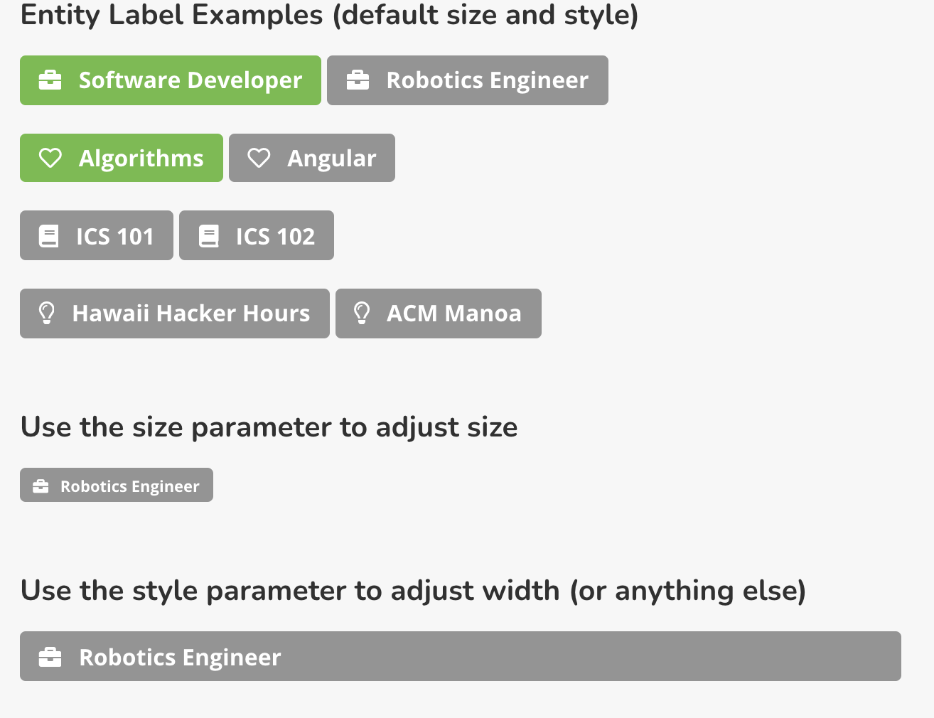
To represent these four entities, we have created a set of four components called CareerGoalLabel, InterestLabel, CourseLabel, and OpportunityLabel. Invoking them renders a label containing the name of the entity with an appropriate icon. Clicking them takes the user to the corresponding details page. If a userID is provided, then the default color (grey) is replaced by green if the entity is in the user's profile.
Here are some examples of their invocation:
And here is what they look like:

Some key design properties of these components:
- The only required parameter is the slug for the entity.
- All labels are also links to the corresponding details page.
- If you provide the optional userID, then the label will be colored green if it's in the user's profile, grey if not.
- The optional size parameter can be used to adjust the size of the label. Use the Semantic UI size strings ("tiny", "small", etc.)
- Use the optional style parameter to adjust the width. For example, if you have a grid with columns, you can use
width: '100%'to make the label stretch the width of the column.
Solution: UserLabel
A UserLabel is even more simple than the above labels: they take a required username (i.e. email address) and an optional size parameter.
For example, here are four invocations for four hypothetical users:
And these invocations result in the following four UserLabels:

size parameter
The default size parameter value is 'large', which results in a label with our standard 16pt font. Please use the default size in most cases.
You can override the default size by providing a size parameter with any of the standard Semantic UI sizes.
username parameter
Since many pages are passed a profile document as a property, profile.username is often a convenient way to display the UserLabel associated with the current user. But you can also generate a label for any other RadGrad user by passing their username.
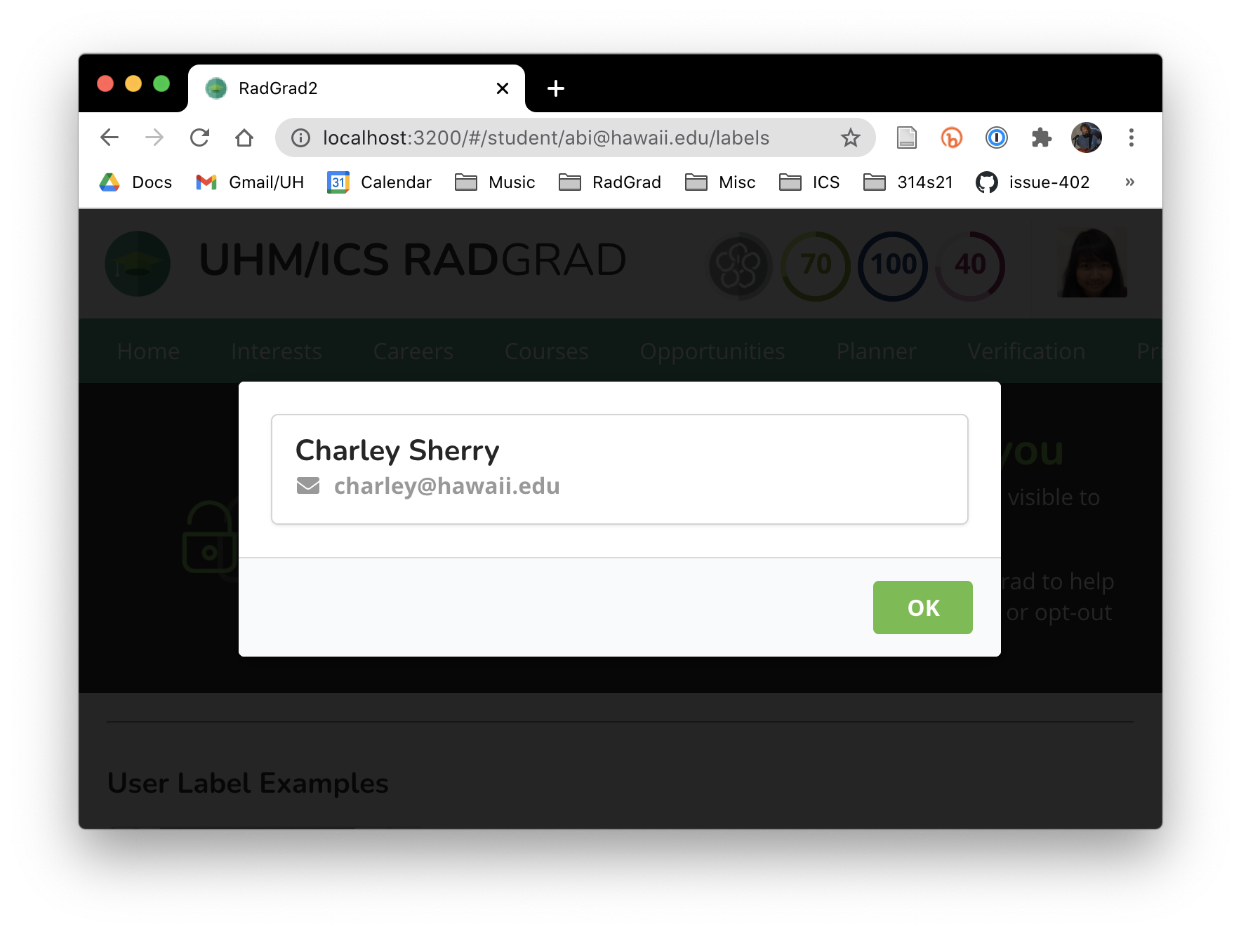
Since all users agree to share their email address and their name as part of the terms and conditions, we can always generate a UserLabel with at least their name. (For example, the "Charley Sherry" label above.) Whether the label contains additional information depends upon what sharing has been enabled.
sharing options
Students have the option of sharing, in addition to their name and email address, one or more of their: Level, ICE Points, website, picture, interests, career goals, opportunities, and courses. If a student elects to share their picture and/or Level, then it will be displayed in their UserLabel.
In the above example, Abigail and Betty are both electing to share their picture and Level, so these are displayed in their UserLabel, and their UserLabel is shaded with the color of the Level. However, Charley is not electing to share either, so his UserLabel is plain white and just displays his name.
Faculty, Advisors, and Admins all "auto share" any information they make available. So, their website, picture, interests, and career goals will be displayed if available. These users do not have a Level, or ICE Points, or Opportunities, or Courses, so these are not relevant for sharing.
Solution: UserProfile
All UserLabels are clickable. When clicked, they pop up a modal dialog containing additional information about that user. How much additional information is displayed depends upon what information is shared by that user. We call this modal dialog the "UserProfile".
For example, Charley Sherry is a (hypothetical) student who has not chosen to share any information. After clicking on his UserLabel, the following UserProfile appears:

The above UserProfile illustrates the minimal information for a user when they have chosen to not share any additional information.
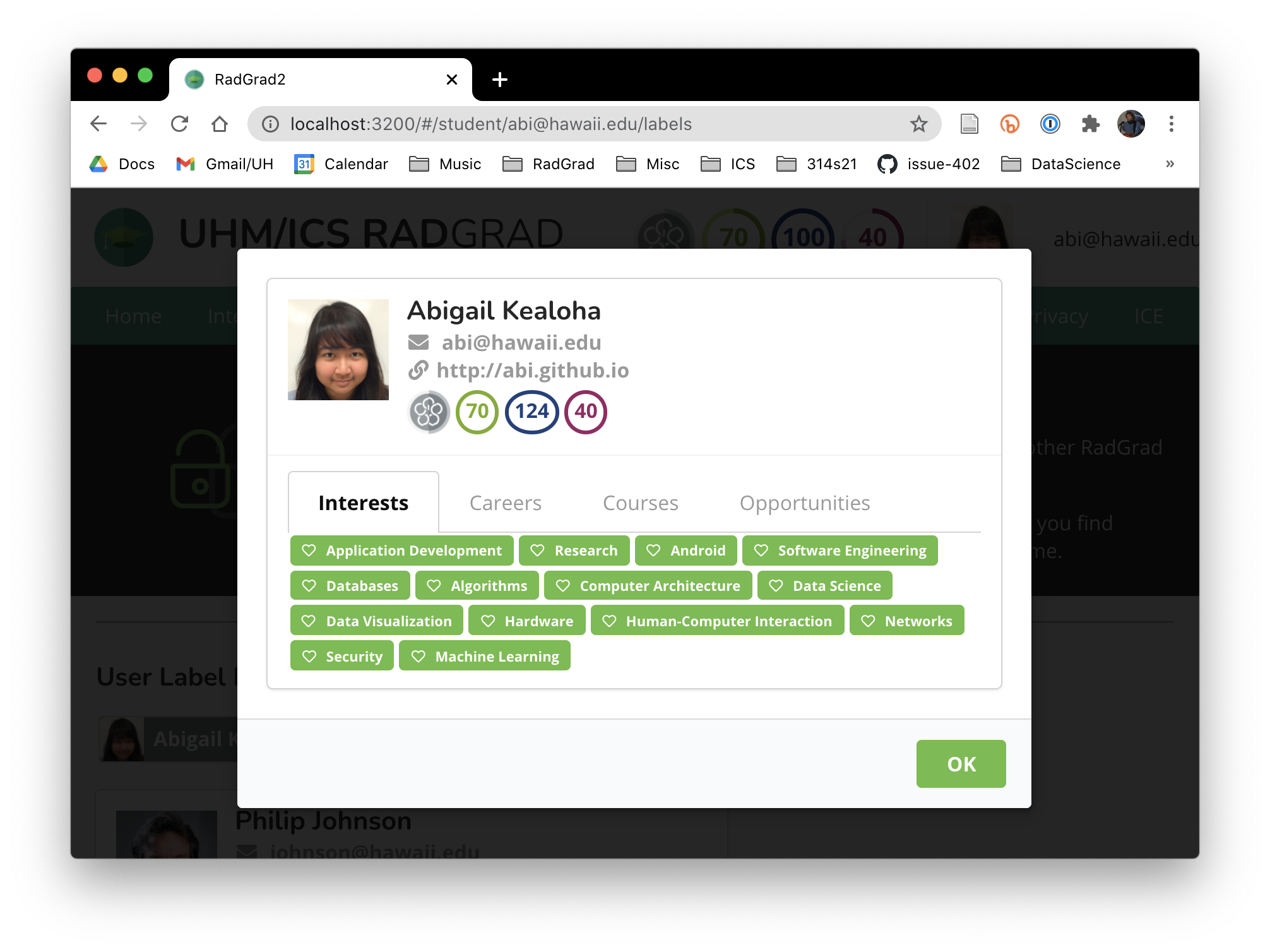
In contrast, the hypothetical student Abigail Kealoha has chosen to provide a website and profile picture, and share all possible information. Clicking on her UserLabel results in the following UserProfile:

Note that clicking the tabs will reveal additional entities, and that clicking an entity will take you to the page with details about it.
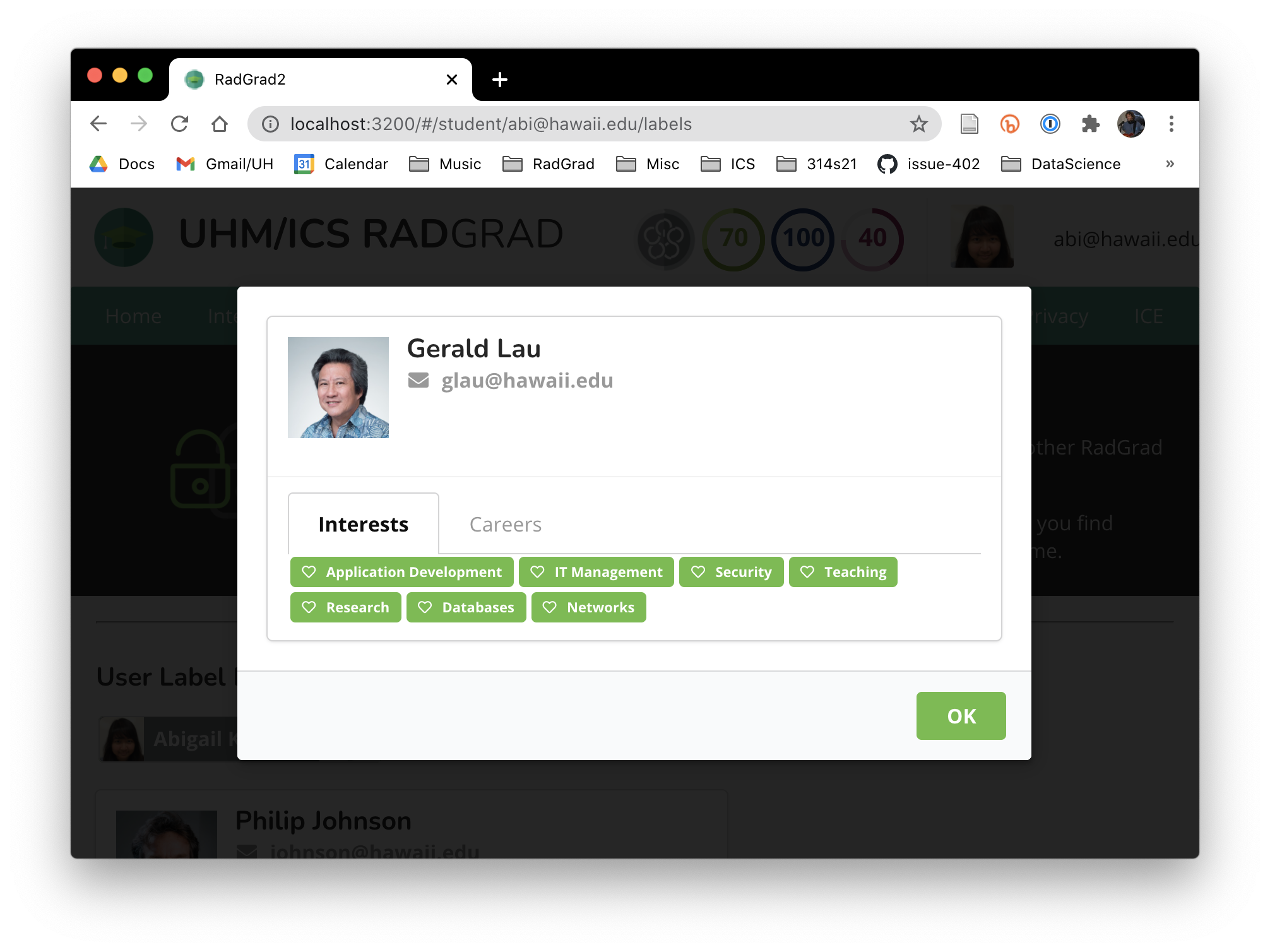
Finally, advisors and faculty "auto-share" whatever information they have provided in their profile. So, clicking on the Gerald Lau UserLabel reveals his interests and career goal areas of expertise as well as his photo:

Since Gerald has not provided a website link, it is not displayed in his UserProfile.